I decided it was time for some training and to learn to be more business savvy and find out how things work. Here in New Zealand, we’re lucky to have some FREE Training for Businesses in the Digital Market. I joined up and started watching the videos. The first one was on BRANDING.
BRANDING
It’s about who you are, what you wish to portray to others, what you do, how you do it and the story behind everything. With saying this… It’s time to introduce myself.
I’m a small business owner who went the wrong way into business. I started a company with little knowledge or thought about what I was doing. I made mistakes, which I’ll call my ‘learning curve’ and gained me some knowledge I needed to move forward. Though I have a legal company, I treated it more like a hobby business. I’d no idea how to grow my clientele list because marketing wasn’t a top priority. Not that I knew how to market my business.
Six years on…
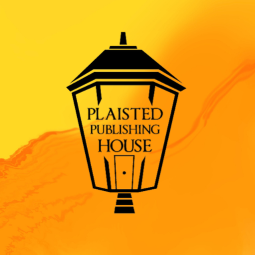
It’s time to learn and grow. As mentioned above, the first step is BRANDING. The video I watched mentioned psychology of colour and typography. It mentioned how LOGOs are developed to grab attention of customers. Below is my original LOGO, which was designed by Lauren Waters. The design is based on an old family street light, which is still standing outside the building in Woolwich, London, over 200 years later. To me, it showed strength and character.
I used black and white (certainly no psychology here). The idea was to use this LOGO on colour background, however, BRANDING is about using the same LOGO consistently. Something I did to a degree, though it also had changes over the years.
Yesterday, I looked up the Psychology of Colour and Typography suggested by the video. Lots of information, and the reading started. I enjoyed reading what Richard Larson had written. It showed you what the different types of FONTs meant, along with the different meanings of COLOURS many of these used by big business. Below is a list of both along with the website so you can read and understand the concepts of this type of psychology.
Read this blog post by Richard Larson to understand the concepts behind what graphic designers do to create your LOGO. It’s an eyeopener.
Psychology of Colour in Fonts and Content Branding
FONTS AND THEIR MEANINGS
- Serif fonts are associated with authority, tradition, respect, and grandeur.
- Popular Serif Fonts: Times New Roman, Bodini, Georgia, Garamond, and Baskerville.
- Sans Serif fonts are associated with being clean, modern, objective, stable, and universal.
- Popular Sans Serif Fonts: Helvetica, Verdana, Arial, Century Gothic, and Calibri.
- Slab Serif fonts are associated with bold, strong, modern, solid, and funky.
- Popular Slab Serif Fonts: Rockwell, Courier, Museo, Clarendon, and Bevan.
- Script fonts are associated with being feminine, elegant, friendly, intriguing, and creative.
- Popular Script Fonts: Lobster, Zapfino, Pacifico, Lucida, and Brush Script.
- Modern fonts are associated with exclusivity, fashionable, stylish, sharp, and intelligent.
- Popular Modern Fonts: Infinity, Eurostyle, Majoram, Matchbook, and Politica.
COLOURS AND THEIR MEANINGS
- Blue: Trust and Security, Calmness, Peace & Honesty, often used by banks
- Green: Associated with wealth, Easiest color for the eyes to process, often used to represent health and wellbeing
- Yellow: Optimistic & Youthful, Fun, Humour, Lightness, Intellect, Logic and Creativity
- Orange: Stimulates Creativity & Productivity, Creates a Call for Attention
- Red: Creates urgency, vitality & stamina, energy
- Pink: Romantic & Feminine, Often Aimed at Girls or Women
- Purple: Soothe & Calm, Intuition & Imagination
What is your business? What is your story? How can psychology help you grow your business?
Discussion is open, and comments are welcome.